Timeline: 7 months (Flexible Schedule)
Team: Slavo, Haik Melconyan (Mentor)
My Role: Product Designer
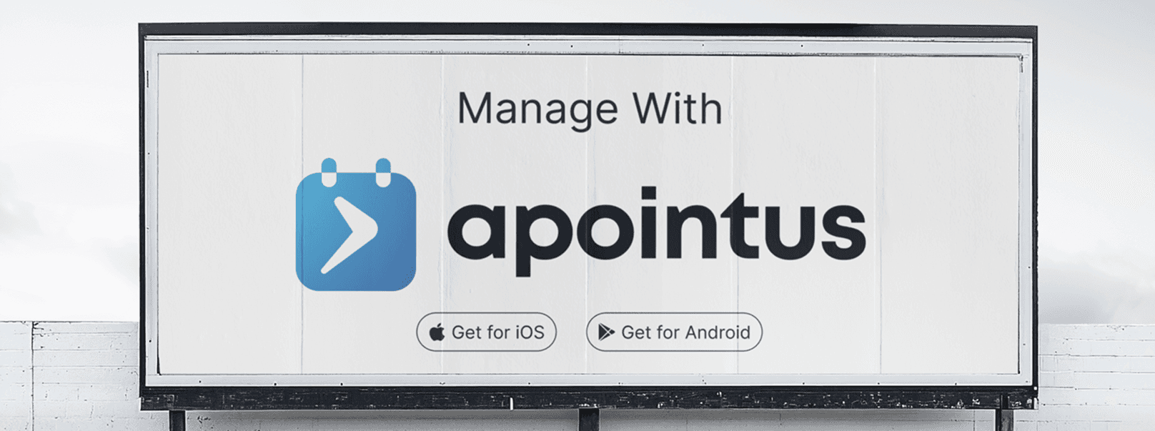
With Apointus, managing appointments becomes effortless. Our intuitive tools let you handle bookings, cancellations, reminders, and availability all in one place.
Challenges

Product Figma Files Timeline
Apointus required a unified experience across multiple platforms, a Client-Facing Booking Web App, a Back-Office Dashboard for Business Managers, and a Dedicated Mobile App for Employees. Each user group had different needs and workflows, which made alignment difficult.
The main challenge was connecting these fragmented experiences into one consistent, intuitive ecosystem. This included simplifying the booking flow for clients, building a centralized smart calendar, managing employee availability, integrating reviews, and ensuring smooth communication between all sides.
Additionally, creating a complete brand identity and brandbook required establishing a visual language that would scale across web, mobile, and marketing touchpoints without losing clarity or professionalism.
Goal & Metrics
The main goal was to build a unified and intuitive appointment ecosystem across the client-facing web app, Back-Office dashboard, and employee mobile app. I focused on simplifying the booking flow, creating a centralized smart calendar, and improving daily task management for specialists. A key part of the project was developing a scalable brand identity and ensuring visual consistency across all platforms. Success was measured by faster bookings, reduced management time for specialists, higher adoption of the employee app, and positive feedback during usability testing.
Research & Insights
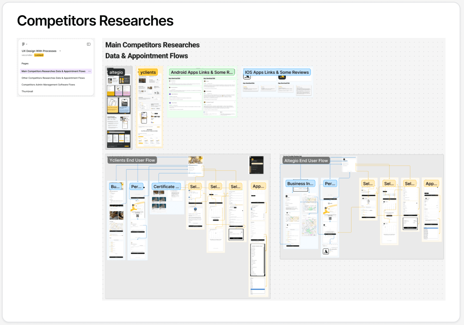
Main Competitors client-facing web app Flows
Interviews & Survays → To understand the real needs of businesses, specialists, and clients, we conducted comprehensive research. I personally explored our main competitor’s platform by signing up as a car wash business owner, which allowed me to interact directly with their customer support and gain insider insights about their subscription offerings, pain points, and workflow.
These first-hand findings, combined with user feedback and competitor analysis, revealed key challenges: businesses struggled with fragmented workflows, clients wanted a faster and clearer booking process, and specialists needed a more efficient way to manage schedules, availability, and reviews.
Throughout this process, Haik, a lead designer with 10+ years of experience and my mentor on this project, guided me in synthesizing these insights and translating them into actionable design decisions that informed the foundation of Apointus.
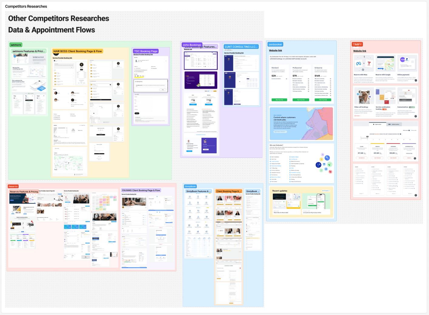
Other Competitors Researches
Design Process – Client-Facing Web App
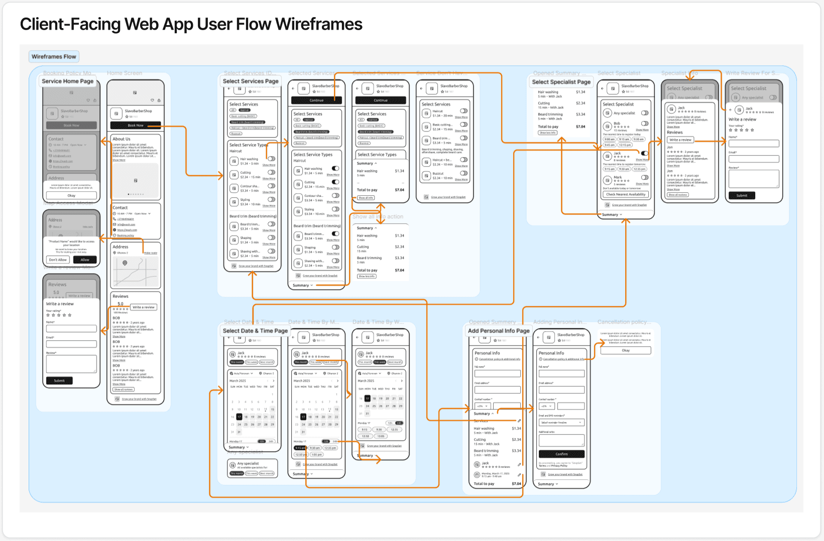
user flow wireframes
For the client-facing web app, I led the design of the complete user flow from research to high-fidelity interactive prototypes. I started by mapping user flows and creating multiple flow scenario variants to explore different approaches. After evaluating these options, we selected the most effective flows and finalized three main paths: Single Branch Flow, Multi Branch Flow, and Specialist Custom Link. I also designed a dedicated Write Review flow to ensure a seamless post-appointment experience.
All interactive prototypes were built in Framer as clickable hi-fi versions to test interactions and validate the experience. For the final UI design, I prepared a comprehensive Figma file including a Color Library with variables, Typography & Icons, and reusable Components. Screenshots from each of these assets illustrate the consistency and scalability of the design system.
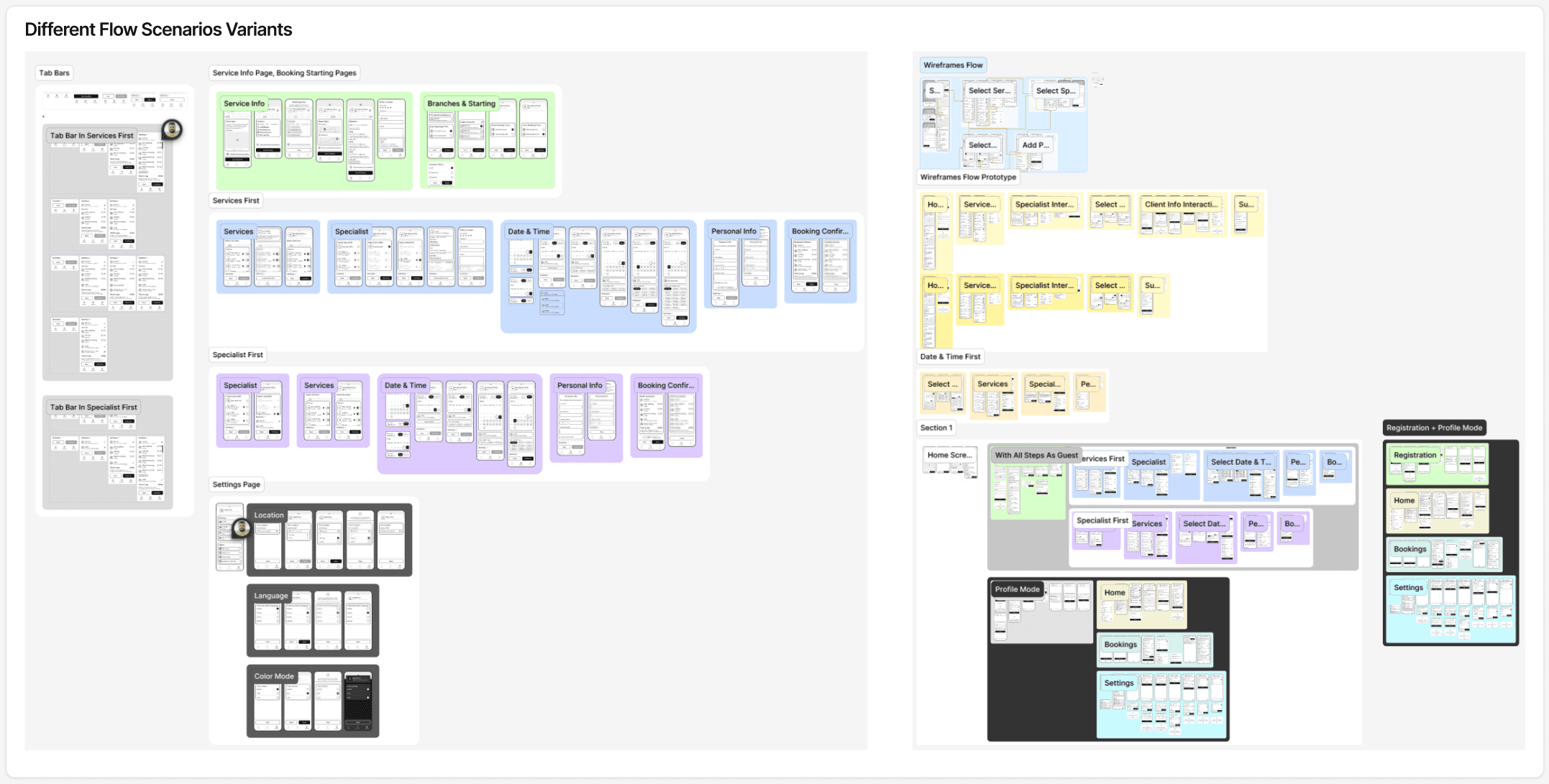
Different Flow Scenarios Variants
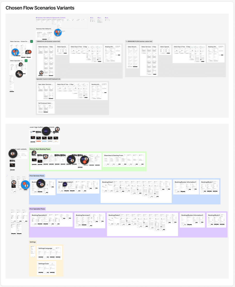
Chosen Flow Scenarios Variants
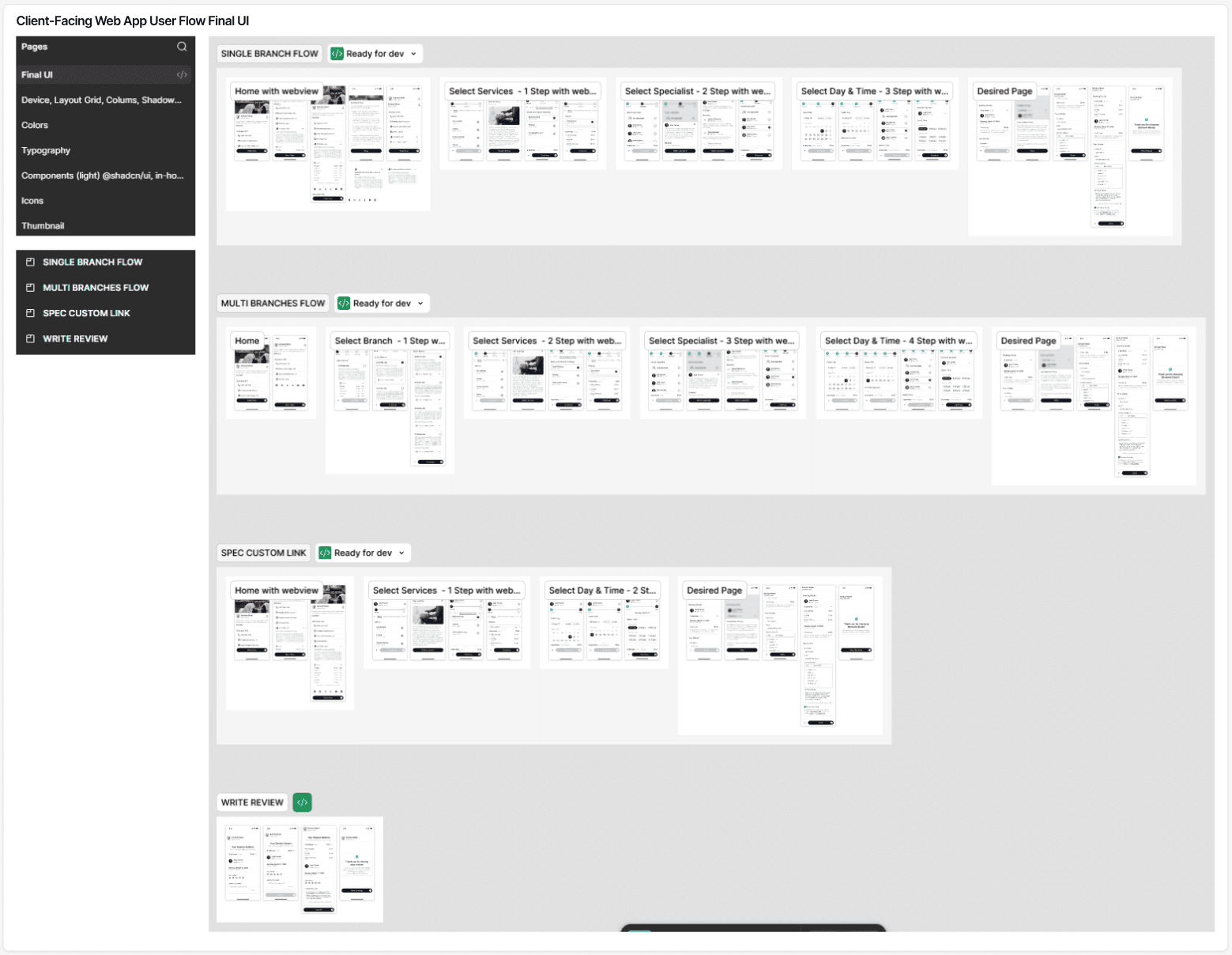
client-facing web app flow Final UI

Color Library & variables

Typography & Icons

Components
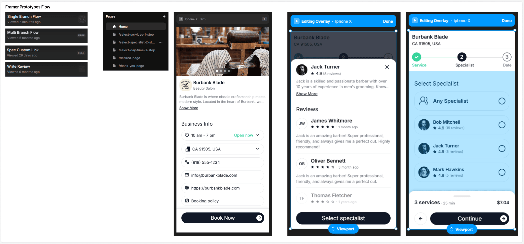
Framer Prototypes Flow

Framer Prototype Recording
Design Process – Back-Office for Business Managers
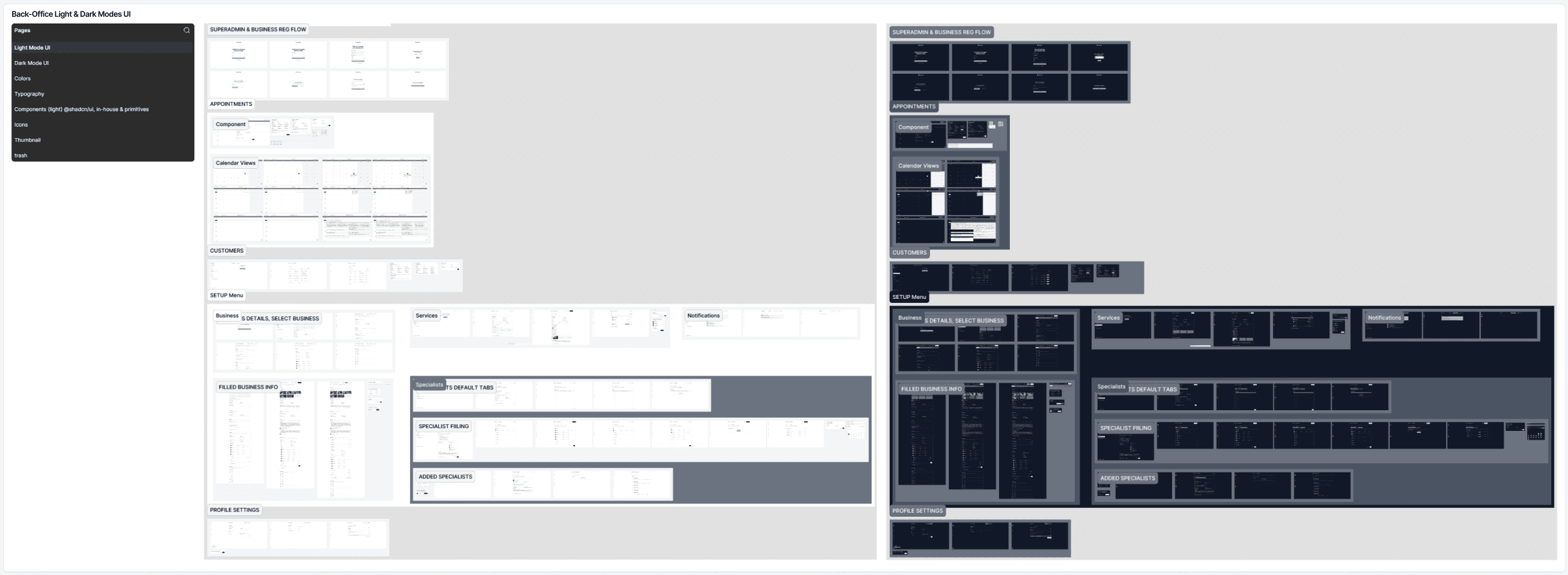
Back-Office Light & Dark Modes UI
For the Back-Office dashboard, I designed a complete interface for business managers, covering both light and dark themes. The sidebar was structured for easy navigation with main sections: Notifications, MANAGE (Appointments, Customers), SETUP (Business, Services, Specialists), and My Account (Profile, Settings, Log Out).
The design focused on clarity, efficiency, and quick access to key business operations. The final Figma file included a comprehensive Color Library with variables, Typography & Icons, and reusable Components, ensuring consistency, scalability, and smooth handoff to developers.
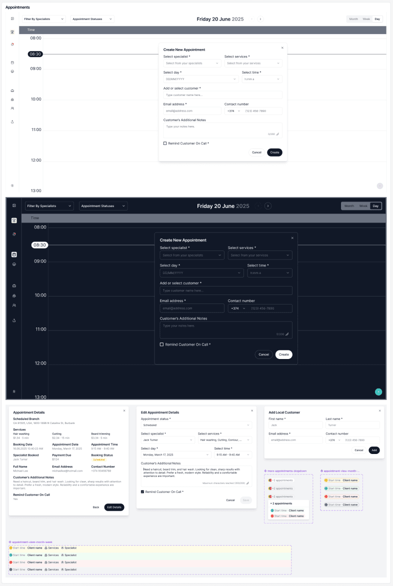
Appointments Tab
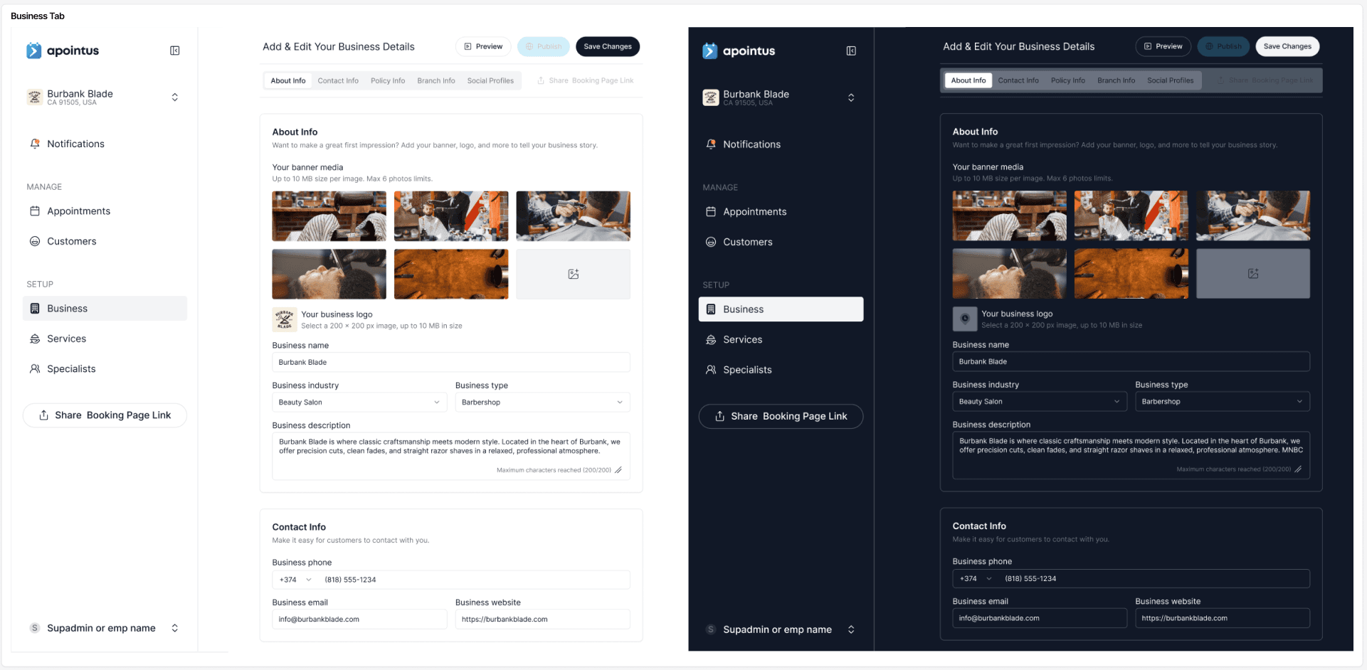
Business Tab

Components & Icons
Design Process – Mobile App for Business Employees


Framer Prototype Recording
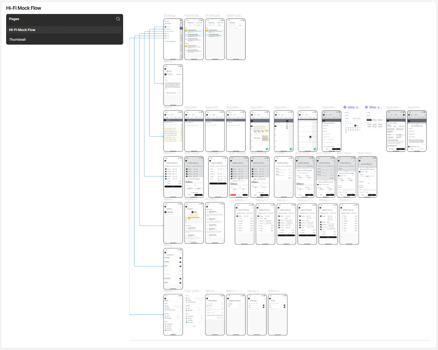
Hi-Fi Mock Flow
For the employee mobile app, I designed a complete experience in both light and dark themes, focusing on daily productivity and fast access to essential actions. The navigation structure included Notifications, Appointments (List, Single Day, Multi Day, and Month views), Profile, Working Hours, Non-Working Hours, Services, Reviews, Settings, and Share.
Because the initial target market is Armenia and Russian-speaking regions, I created full UI versions in Armenian and Russian to deliver a localized, more familiar user experience. During the process, I used references from my research, including the Google Calendar mobile app and several competitor tools, to guide the interaction patterns and improve clarity.
The final Figma file followed the same structured system as other Apointus platforms, with dedicated pages for Color Library & variables, Typography & Icons, and reusable Components, ensuring consistency across the entire ecosystem.
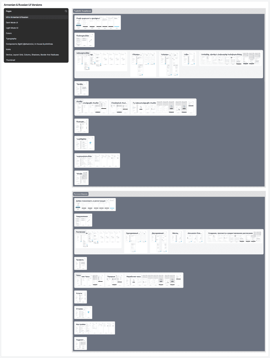
Armenian & Russian UI Versions

Light & Dark Modes UI

UI Screens
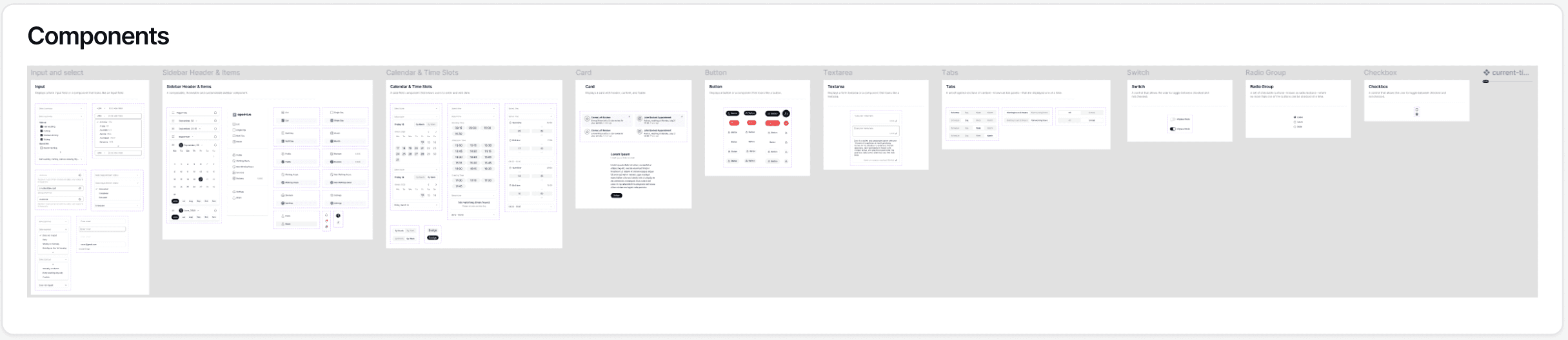
Components
Design Process – Responsive Website

Responsive Website UI
For the Apointus responsive website, I designed layouts for Desktop, Tablet, and Mobile, ensuring a smooth and consistent experience across all screen sizes. The landing page focused on interactive storytelling: each product feature was presented through an interactive container where users could explore real product behavior. Visitors could walk through the client-facing web app booking steps, test calendar views from both the Back-Office and specialist mobile perspectives, and preview how business details entered by managers appear on the client-side interface.
The final UI in Figma followed the same structured system as the rest of the project, with dedicated pages for Color Library & variables, Typography & Icons, and reusable Components, ensuring a cohesive visual language across every platform.

Landing Screen

Components
Design Process – Brand & Logo Manual Guideline

First Logo Variant
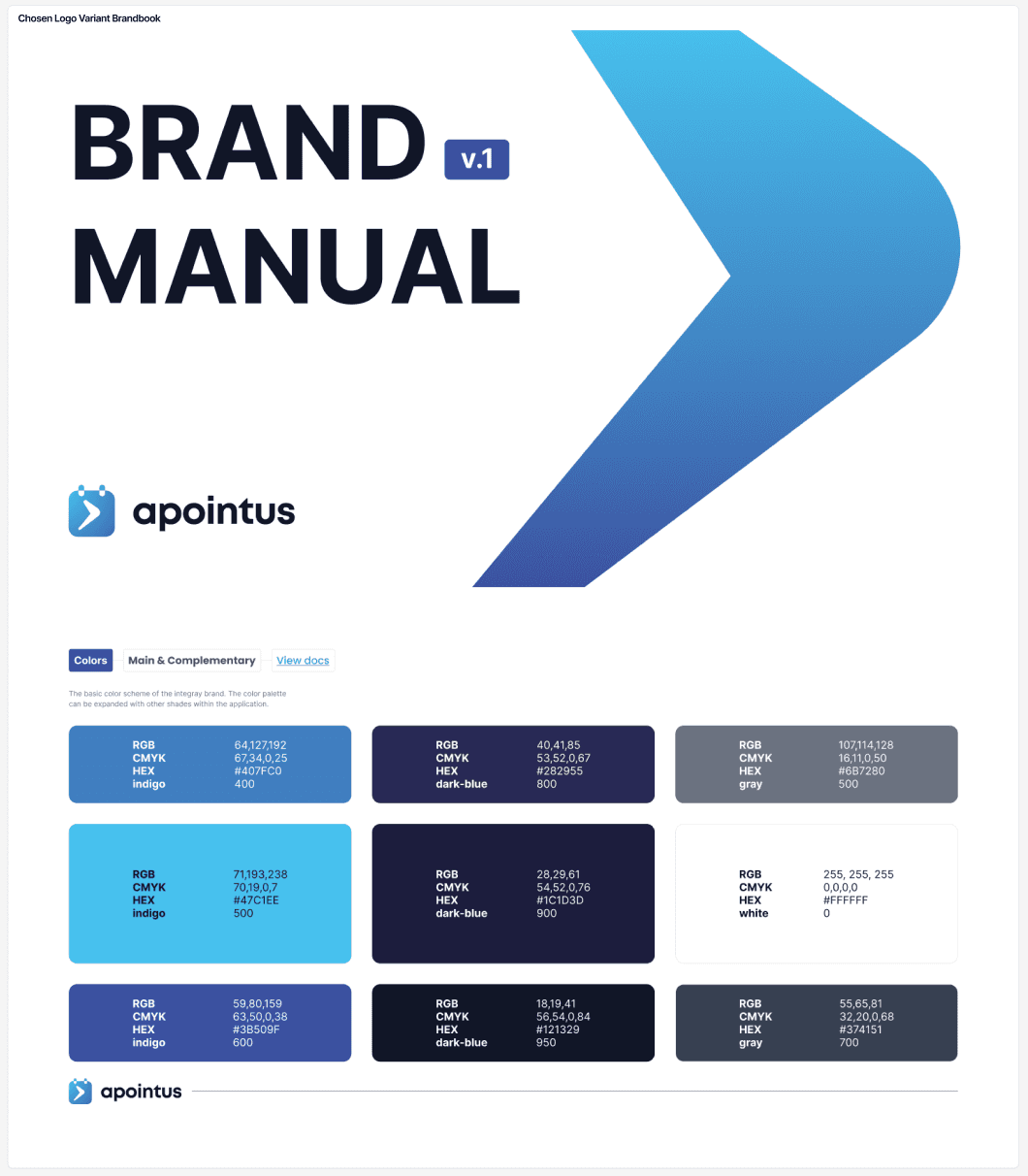
During the branding stage, I explored multiple logo concepts, experimenting with different icon directions, colors, and visual styles. After several iterations, we selected the strongest concept and refined it further, including an important shift from the original emerald color to a more modern and accessible indigo blue palette. This ensured better contrast, clarity, and consistency across all digital platforms.
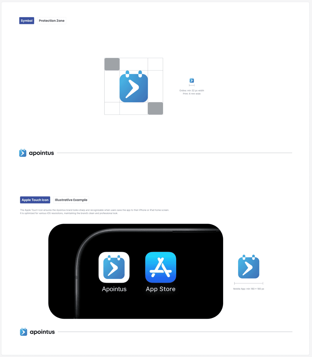
I created a complete Brand & Logo Manual, documenting every key element, logo usage, colors, typography, spacing, iconography, and visual rules, to maintain a unified identity across Apointus products. In the final stages, a professional graphic designer also supported the process, helping refine the brand assets to a polished, production-ready standard.
final Version
Guideline Screens

Branding Screens
Final Solution
Solved Problems → Apointus delivers a fully connected appointment management ecosystem that solves the core issues identified during research. The new client-facing web app provides a fast, intuitive booking flow with clear steps and no friction. Business managers now have a centralized Back-Office with powerful tools for handling appointments, customers, services, specialists, and notifications—available in both light and dark themes. Specialists benefit from a dedicated mobile app with multiple calendar views, localized Armenian and Russian interfaces, and streamlined controls for working hours, services, and reviews.
The responsive website introduces interactive product storytelling, allowing users to preview real feature workflows directly on the landing page. A unified brand identity and logo manual ensure visual consistency across all platforms, supported by a scalable design system built with a shared color library, typography, icons, and components.
Overall, Apointus successfully eliminates fragmented workflows, reduces scheduling complexity, speeds up booking interactions, and provides a cohesive experience for clients, business managers, and specialists.
Results & Impact
The Apointus ecosystem created a measurable improvement across all user groups. Clients experienced a faster, more transparent booking process, increasing completed bookings and reducing drop-offs during peak hours. Business managers reported a noticeable decrease in time spent managing schedules, thanks to the centralized Back-Office and clearer calendar logic. Specialists benefited from the dedicated mobile app, which improved daily workflow efficiency and increased adoption of digital scheduling instead of manual methods.
The localized Armenian and Russian interfaces strengthened early-market relevance and helped businesses onboard their teams with minimal training. Interactive website feature demos increased user engagement and contributed to higher conversion rates during early promotional campaigns.
The unified brand identity and fully scalable design system improved development speed, reduced inconsistencies across platforms, and set a strong foundation for future product expansion. Overall, Apointus delivered a more connected, efficient, and user-centered appointment experience that raised satisfaction across clients, managers, and specialists.
Reflections
Key Learnings → Working on Apointus gave me the opportunity to design a complete product ecosystem from the ground up, Client Web App, Back-Office, Employee Mobile App, Responsive Website, and a Full Brand Identity. One of the key learnings for me was understanding how deeply connected these platforms must be to deliver a seamless experience. Collaborating closely with my mentor Haik and our engineering team helped me refine complex flows, validate design decisions, and think more systematically about scalability and product consistency.
Another major insight was how valuable hands-on competitor research can be. By joining a competing platform as a business owner and speaking directly with their support team, I uncovered real operational gaps and user frustrations that strongly influenced our final solutions.
Will Improve Next → Since product is still in the development phase and not yet launched, I see several areas to improve as we move toward the first beta release. I plan to continue refining onboarding experiences, increase clarity in calendar interactions, and further optimize cross-platform consistency based on real user feedback once testing begins. As engineers complete more modules, I will keep iterating on usability, polishing the design system, and preparing additional UI states to support edge cases.
Overall, this project strengthened my skills in multi-platform design, UX
decision-making, and product thinking, while highlighting how important collaboration, research, and iteration are when building a full product ecosystem.
Tools & Deliverables
Tools Used → Figma, WCAG Checkup, Framer, Vo, ChatGPT, shadcn/ui design system
Deliverables Created → Wireframes & Prototypes, Hi-Fi Clickable Prototypes in Framer, Design System, UX & Content Writing, UX Writing, UX Audit, Full Brand Identity